
Creating a Design System for Finance of America Companies
• When: October 2022 – March 2023
• Role: Lead Designer - strategy, primary contributor, author, & approver
• Deliverables: Figma design system library file & Storybook component library
Opportunity
Finance of America (FOA) owns several companies, each with its own brand and visual identity: Finance of America Mortgage (FAM), Finance of America Reverse (FAR), Finance of America Home Improvement (FAHI)
The leadership team wanted to unify the brand and customer experience across these companies. I proposed creating an enterprise-wide design system to standardize the visual language and speed up development. With executive support, I was chosen to lead the initiative. Having worked on other design systems before, I was excited about the impact it could have on FOA. The goal was to create a unified resource for product development and marketing sites across all FOA companies.

Table of Contents
Customers
Accessibility
Principles
Brand
Colors
Spacing
Typography
Elevations
Grids
Buttons
Float-label fields
More components
Common attributes
Name
Logo
Development process
Release date
4 months later
1. FOUNDATIONS
Customers
I began the project by revisiting our customers and their needs. I created customer personas and journey maps (like the one below) to uncover insights that would inform the design system.
Our customers are typically 55–75 years old and not highly tech-savvy. As a result, the design system needed to prioritize accessibility, rely on familiar component patterns, and avoid trendy interactions that could cause confusion.
Their digital journey spans marketing websites, lead forms, authentication, and account or portal setup for secure document upload and document signing. Mapping this journey helped me identify and prioritize the most critical components for the initial design system launch.

Accessibility
I referenced the Web Content Accessibility Guidelines (WCAG) 2.1 and targeted the AA level of conformance. I ensured that all typography and UI elements met or exceeded the required contrast ratios:
• 4.5:1 for ‘normal’ text (below 18pt)
• 3:1 for ‘large’ text (18pt or greater)
• 3:1 for components and graphics
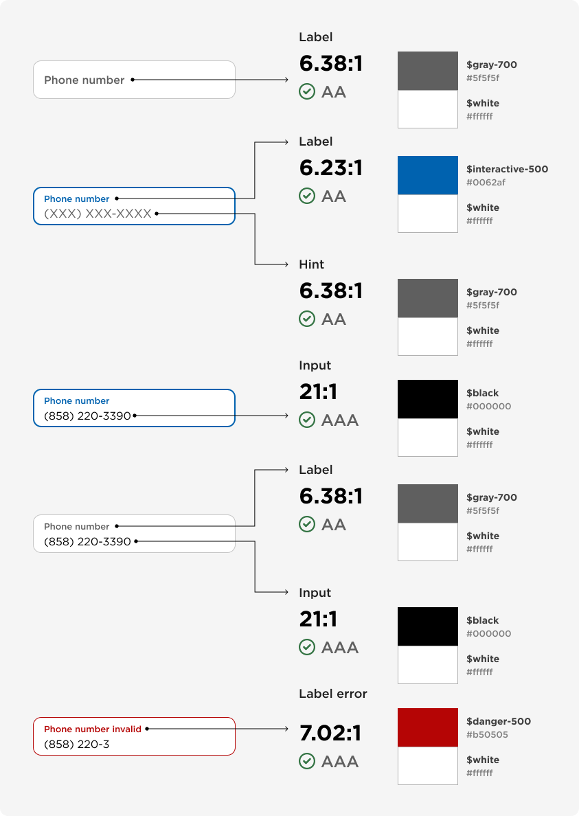
I created a login template for various tests. Here you can see that all UI elements exceed the AA level success criterion for contrast. I utilized the Stark plugin to test color contrast ratios for type and graphics within the working Figma file.

Principles
I wrote a few design principles that have proven valuable to me in past work. Each principle helps to explain my rational for the thousands of micro design decisions I’ve made while creating the design system. These principles are intended to evolve with the design system and can be used as a tool to measure, evaluate, and drive design decisions with a shared language and vision.

Brand
I conducted a brand audit across FOA’s companies and found that the FOA Reverse brand had the most up-to-date styling. I selected this brand as the foundation for the design system, extracting its color palette, primary typeface, and iconography to establish the system’s core elements. I presented this approach to marketing leadership and received approval to proceed.

2. TOKENS
Color
Most brand colors—aside from the dark blue Denim—are too light for use in typography and UI components, as they lack sufficient contrast on light backgrounds.
To address this, I generated shades and tints for each brand color, expanding the palette with lighter and darker variants. The darker variants support accessible typography and components, while the lighter ones are used for subtle UI elements such as dividers and background fills. These expanded palettes also provide a broader range of on-brand colors for graphics and illustrations. Even with these additions, some color gaps remained.
To fill those gaps, I introduced new feedback palettes—yellow for warnings and red for danger—as well as a high-contrast palette for primary interactive elements (CTAs, links, tabs). I also created a more balanced gray scale to support borders, fills, and typography.
Finally, I added a single bright blue used exclusively as a universal focus state across all components.
Typography
I created a type scale that establishes a clear visual hierarchy for both content-heavy marketing sites and interaction-driven web products.
Drawing on more than seven years of experience working on the home improvement product suite, I reused many existing header and paragraph styles. To support large-scale marketing layouts, I added three display styles.
I validated the scale by creating sample layouts and testing the relationships between titles, subtitles, and body copy. I also evaluated line height across varying viewport widths, refining ratios to ensure readability for each text group—display, header, and paragraph styles.

Font scaling
I met with front-end engineering leads from both marketing and product to understand how typography was set and scaled across platforms. I learned that Product reduced font sizes at smaller breakpoints, while Marketing used responsive font scaling (RFS). We aligned on using RFS for text above 20pt, allowing more granular scaling across viewport widths from 360px to 1200px. This alignment introduced a new design challenge: how to represent scaled text styles per viewport.
To solve this, I partnered with engineering to create an HTML test page that demonstrated how text styles above 20pt scaled using RFS. I tested common viewport widths and inspected the resulting font sizes. Based on these findings, I created device-specific text style variants—desktop (L), tablet (M), and phone (S). These variants enabled designers to accurately represent RFS in layouts and ensured visual consistency between design and development.
Spacing
For spacing between UI elements, padding, and margins we use spacing units that are mainly multiples of 8px. However, sometimes there is a need for tighter spacing below 8px in which case we’ll use an even number (i.e., 2px, 4px, 6px). Spacing units are calculated in rem. The root em is set to 16px.
Elevations
I created four elevation levels to use within the UI to simulate depth. The elevations follow a few general rules that create a consistent visual look, hierarchy, and allow us to expand this section further in a logical way if needed in the future.
Consistent light-source position - The x axis is always 0. The y axis changes at a rate of 2px from one elevation to the next.
The greater the elevation the greater the shadow blur - The blur changes at a rate of 4px from one elevation to the next. The spread is always 0.
Shadow value - The alpha channel of the shadow color changes at a rate of 4% from one elevation to the next. The shadow value increases with the depth so that elements with a higher elevation stand out from elements with a lesser depth.
Sample elevation levels within the UI
Grids
I discussed grid options with lead engineers from product and marketing. We landed on using Bootstrap’s v5.3 grid system. It comes with six default breakpoints, and has the ability to be customized. This seemed like a flexible system that could accommodate our needs. I created grid styles in Figma for each of Bootstrap’s breakpoints (xs, sm, md, lg, xl, xxl) as well as sample layouts per breakpoint.
3. COMPONENTS
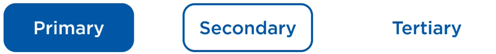
Buttons
Buttons were the first component I built for the design system. As primary calls to action, they set the tone for the design language and must be highly usable, accessible, and visually clear. They require strong contrast, clear hierarchy within groups, and flexibility to work independently or within compound components such as modals and search inputs.
Contrast Compliance
Each button meets or exceeds a level AA standard contrast ratio as set by the Web Content Accessibility Guidelines.
Minimum contrast ratios:
4.5:1 - Label and background colors
3:1 - Component and background colors
Button label contrast
Button component contrast
Focus indicator contrast
Button component controls
I created the button component (primary, secondary, tertiary) with convenient controls that give designers the ability to quickly adjust the size, color, state, icon position, and ability to toggle the label on/off.

Button animation
I animated the button states to stress-test the interactions of each button type and to make the component dynamic for prototyping.
Button base component
I created a base component that is nested within all button variants, giving me global control over 1,680 component variations. This approach allows shared attributes—such as label and icon styling, spacing, padding, and corner radius—to be managed centrally through the base component.
I also created a separate base component for the focus state, providing a single source of truth for the universal focus outline used across buttons and other components.

Primary button component
The pop-out section of the primary button component shows all required variants for a single button size. I duplicated this group to create additional sizes. Once all sizes were defined, I duplicated the full set to create new color themes.

Secondary button component

Tertiary button component

Float-label Fields
Creating accessible and easy-to-read inputs with flexible controls for error handling and known use cases.
Checking contrast compliance
Each part of the field component meets or exceeds a level AA standard contrast ratio as set by the Web Content Accessibility Guidelines.
Minimum contrast ratios:
4.5:1 - Type and background color
3:1 - Component and background colors
Field component controls
I designed this component to support two sizes and ten states covering common use cases. I added toggle controls for error and disabled states, link visibility, character prefix, and character counter, all of which work consistently across sizes and states.

More components…
4. NAME & LOGO
Naming the design system
Our VP of Design asked the team to propose a name for the design system. Designers, engineers, product owners, and marketing partners contributed ideas to a shared list, resulting in 18 options. We ran an initial poll to narrow the list to three finalists, followed by a second poll to select the final name. My submission was chosen as the winner: Symphony.
Why Symphony
A symphony is a complex musical composition created by a full orchestra. Like a design system, it is built from foundational elements working together:
Rudiments — the basics of musical theory, like rhythm (design tokens)
Notes — individual sounds with pitch and duration (components and interactions)
Movements — sections that shape the overall narrative (layouts and templates)
Design, product, and engineering teams act as the orchestra—working in harmony with the design system to create rhythm, consistency, and cohesion across a growing suite of digital products.
When executed well, a symphony creates a lasting experience that evokes emotion and inspires action—just as a strong design system should.
Creating a logo for Symphony
I created four logo concepts for Symphony. Each design is composed of three elements representing key layers of our digital ecosystem: the user interface, the design system, and the back end.
The design team voted on the concepts, and Option #2 was selected as the final logo.
Symphony logo
5. PIPELINE
Development process
How did we go from designed components to “real” coded components that are packaged and ready for distribution? Figma → Jira → Storybook → NPM
Figma library file
Once a component was complete—variants defined, prototyped, and stress-tested—I presented it during a weekly design critique. If the group deemed it ready for development, I then reviewed it in a weekly design system meeting with lead developers. If the devs had no issues, then I created a Jira story to initiate the development.
Jira stories
I created component stories with interaction details and Figma links.
Kanban board
I helped prioritize component stories on the Design System Kanban board. We created 6 columns on the board - from To Do to Done with the In Testing column as a dedicated step for design QA.
Storybook development
We used Storybook to build and test components in isolation. It also served as the primary location for component documentation.
NPM
Once all component stories reached Done, the development team published a new version of the design system package to NPM.
6. OUTCOME
Symphony released on March 10th, 2023
I met with UX, Product, Technology, and Marketing Design teams to demonstrate the design system and invited each group to try it out. I illustrated several benefits for each group:
UX Design
Consistency & Quality
Faster design execution
Improved accessibility
Removes tactical barriers for stronger design thinking
Product
Speed to Market
Scalability
Shared vocabulary between design, product, and engineering
Reduce risk with proven patterns and accessibility
Technology
Development efficiency with reusable, tested components
Faster implementation
Clear expectations around what “done” looks like
Better performance with accessibility baked in
Marketing Design
Consistency & Quality
Faster design execution
Improved accessibility
Removes tactical barriers for stronger design thinking
4 months later, we had 6 implementations! 🚀
1. financeofamerica.com


Sample content block

🔍 Design-system lens
2. foahomeimprovement.com


Sample modal

🔍 Design-system lens

3. Borrower Privacy Preferences (Internal form)

Sample section

🔍 Design-system lens
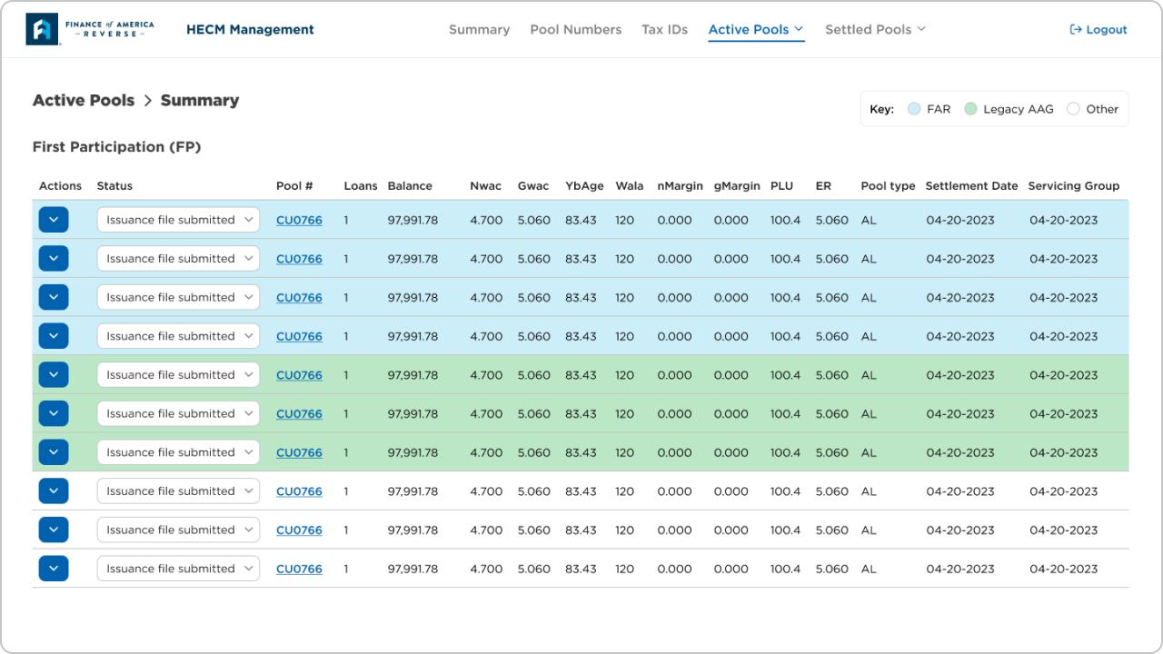
4. HECM Management (internal)
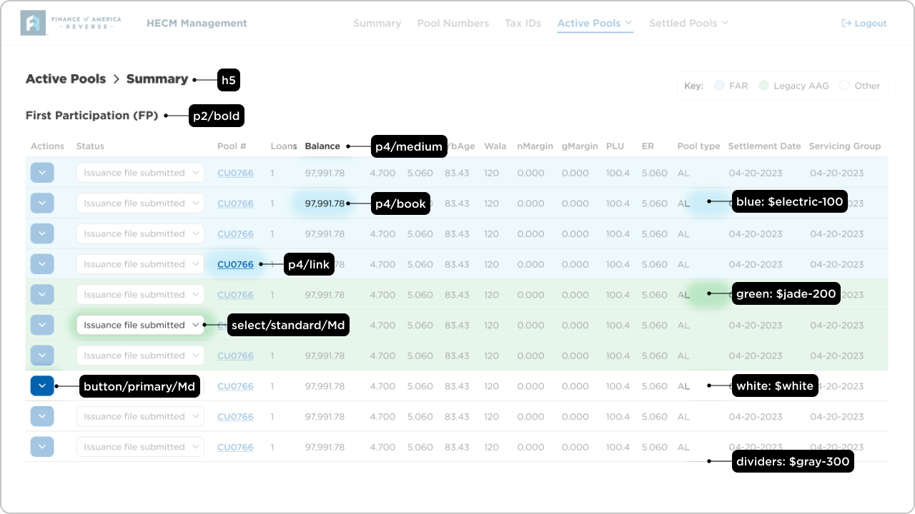
🔍 Design-system lens
5. Broker Portal Log In
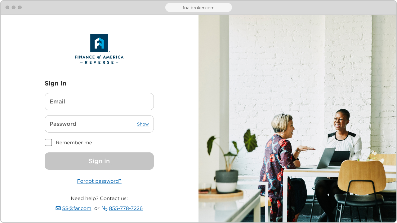

Multi-factor verification (SMS)

🔍 Design-system lens
6. Broker Portal Loan Pipeline


🔍 Design-system lens
Symphony is now a shared foundation used daily by UX, Product, Technology, and Marketing teams. With multiple contributors, the system continues to evolve while maintaining consistency and quality at scale. By aligning design and development around a single source of truth, Symphony has reduced time to market, improved accessibility and usability, and enabled teams to deliver cohesive, customer-centered experiences more efficiently across products and marketing channels.